ZENUS Biometrics is a startup revolutionizing the way people check-in at events using artificial intelligence and facial recognition technology
Ethical Facial Recognition
ZENUS biometrics its a face recognition startup, which approached me with a Web project in mind. ZENUS wanted to redefine its brand in terms of the new business revenue streams that the company was expanding on.
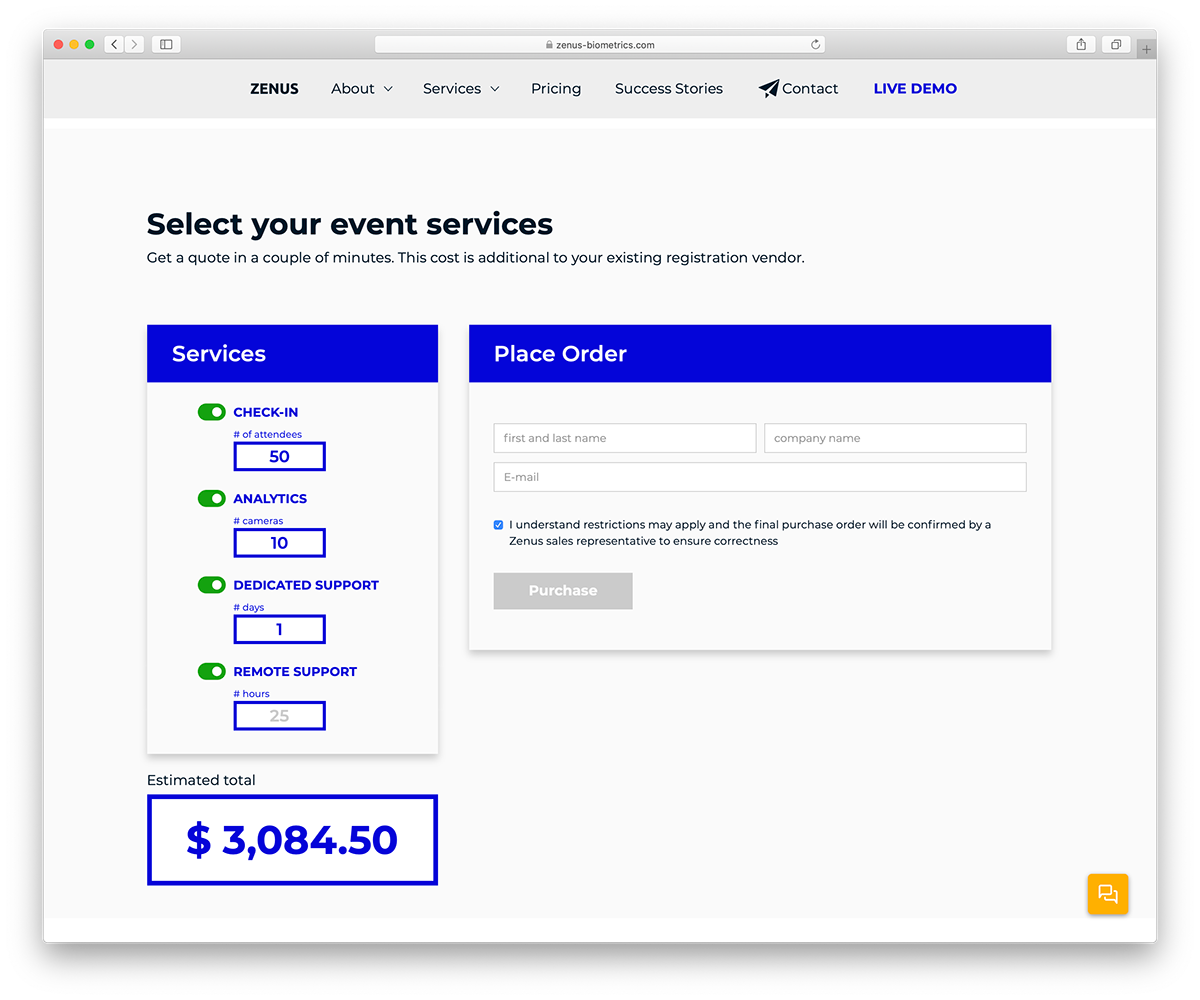
In other words, the problem to solve for the company was to present to their audience the new products that the company was building and convert them into sales with specific forms and dashboards, all of them part of the entry point of communication a.k.a. the ZENUS website.
Branding
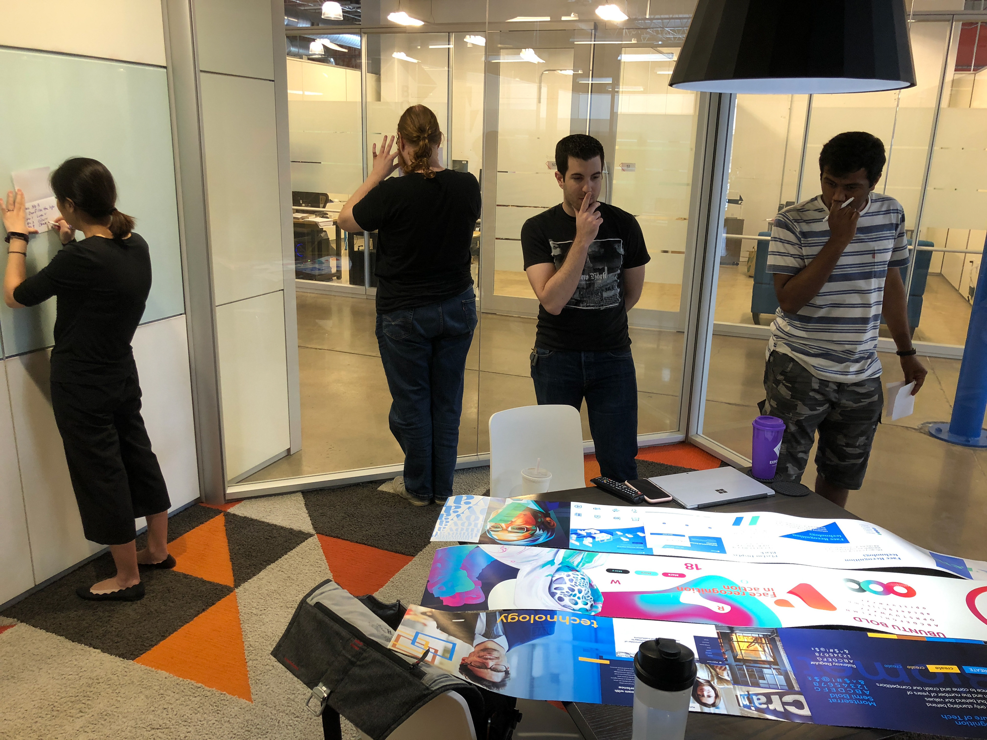
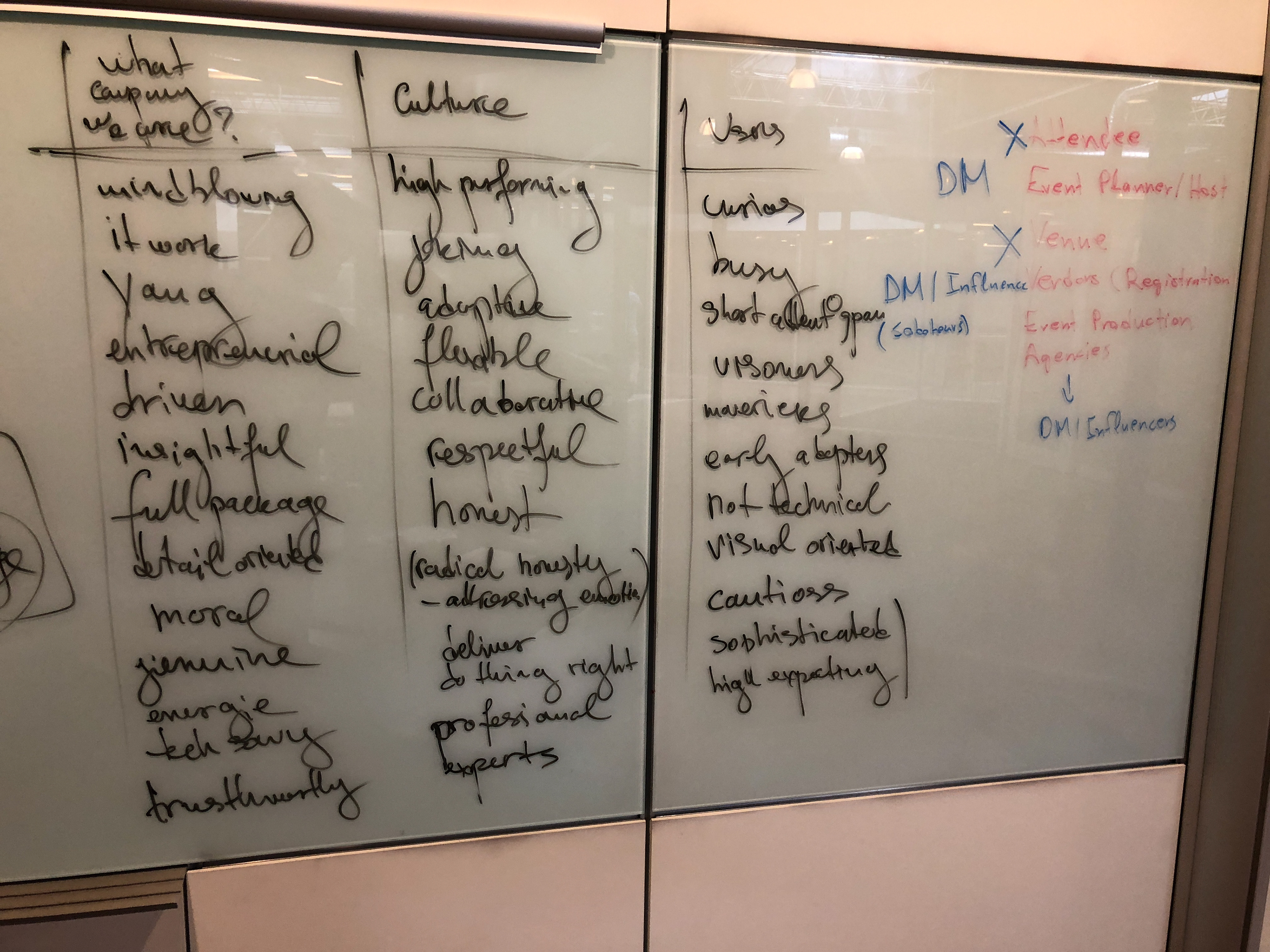
I kickstart most of the website projects with a branding sessions and ZENUS new website project was not an exception. I wanted to identify what the company has, what type of users it targets, what is the most appropriate tone to talk to these users and finally and most importantly what the users will do on the new website that will help the company growth.
For this session, i love to use whiteboards and invite the stakeholders speak about their company and how they see it move forward. I use this as an opportunity to align the vision of the different people representing the company, since they don't have a time to block in their day and think about it.
Creating ZENUS Visual Identity and UIKit
Four weeks of in-depth research into what makes facial recognition AI technology approachable and less scary.
As a part of the user discovery, I had the opportunity to interview six of the major ZENUS clients and ask them about their experience with the company.
Creating the Website Information Architecture
This step was necessary for me to understand how ZENUS was shipping products currently and how we can ease out this transaction with the new website project.
Developing UX Responsive Patterns
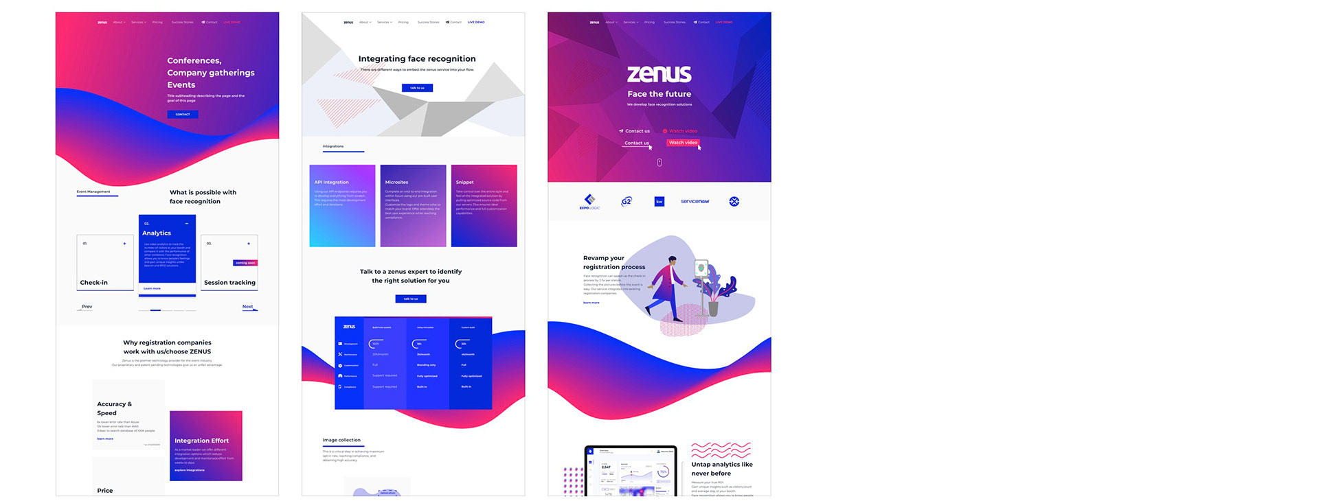
The results from the branding session revealed that there are three possible creative directions for the future branding of ZENUS that were possible. I worked on crafting three stylescapes that represent adequately each one of them and I discuss them with the stakeholders.
Direction 1 : Futuristic, Energized, Exciting, Inspirational, Early Adopters
Direction 2 : Professional, Confident, Convenient, Corporate
Direction 3 : Safe, Trustworthy, Efficient, Associational


Branding Guidelines UIKit
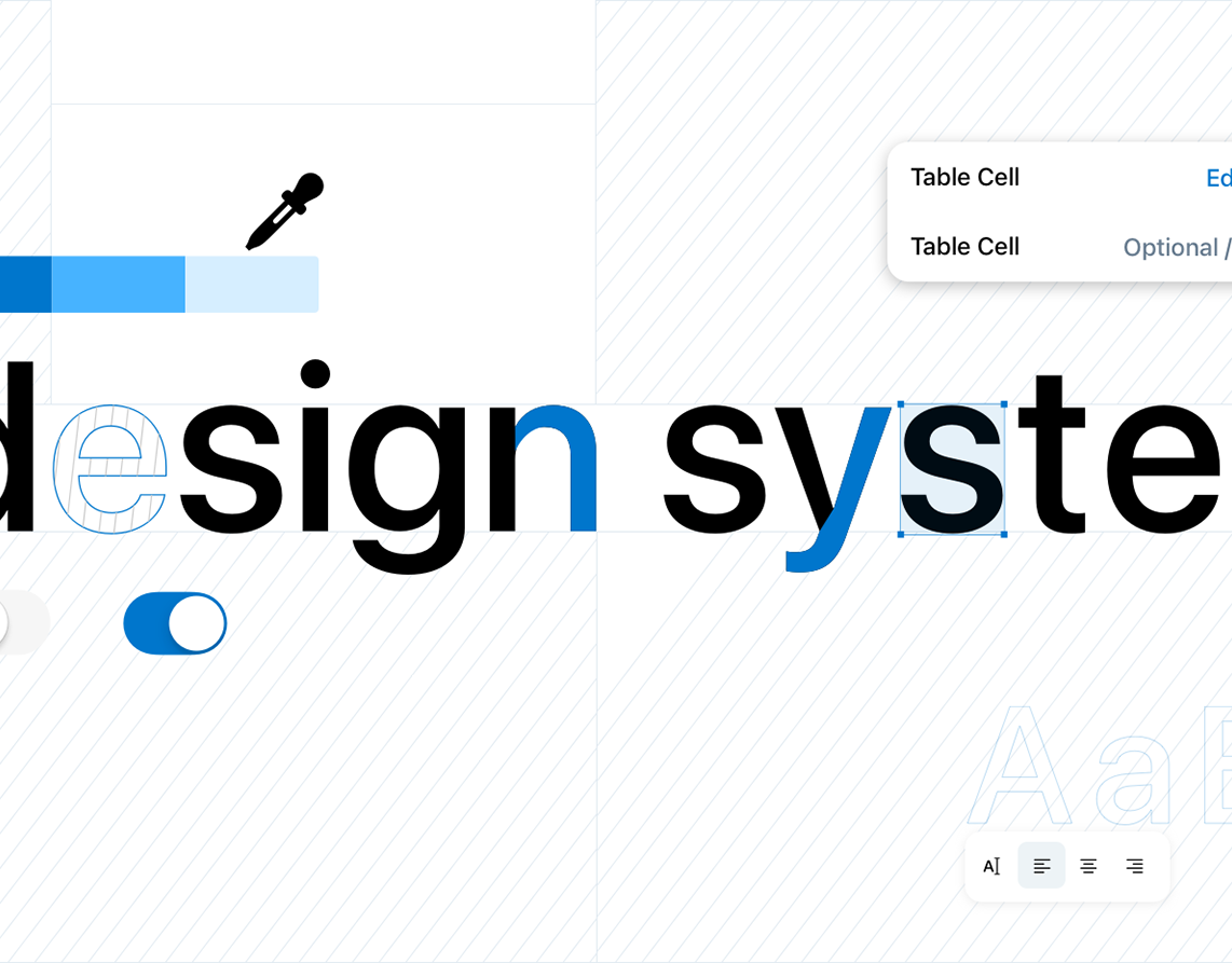
Zenus is a startup and it doesn't have anything built to scale its products. I've started a very simple and clean design system for the Zenus brand that can be customized or expanded later on by their in-house product team. This helped Zenus create online sing-in portals and management dashboards.
Flow / Site Map
After we finished exploring what look we want to built it was about time to get serious and knocked down the spine of the project which was the sitemap of the website. For this purpose i used FlowMap tool. At certain point of the project, I felt the necessity to bring a social media specialist and SEO expert to the sitemap built in order to be confident with the backbone structure of the project. This step allowed me to secure the scope of the website design as well and not have a surprise by the stakeholders later on in the project that we should add one more page here and there.


Final Design Deliverables
Everything built for the website I have compiled it with Zeplin and ship it to the developer team, which was in Mexico. I worked closely with the team until the final implementation of each page.


