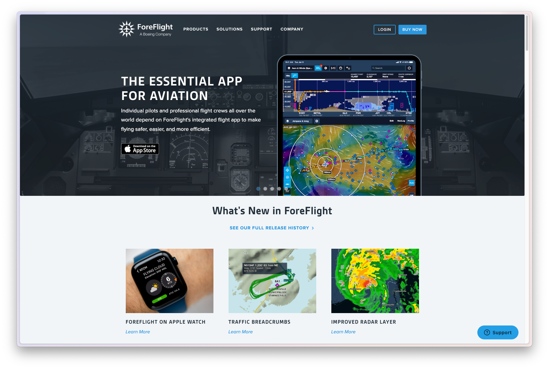
ForeFlight a Boeing Company creates aviation software on iOS for pilots ranging from general aviation to the united states air force
Foreflight Design System
ForeFlight specializes in providing advanced flight planning and navigation solutions for pilots and aviation professionals. Its software allows pilots to plan routes, analyze weather conditions, and optimize fuel efficiency for their flights. The platform integrates with weather services and aviation databases to provide accurate and timely information.
In 2020, ForeFlight's multiple mobile & web services were built by a 14-person design team. The need for visual processes and a coherent user experience that can scale was more than evident as the team grew. Without a standard system and methods, different people will contribute new styles and principles over time, causing the overall product experience to diverge and devalue.
Design system education
Align designers, developers, and stakeholders about what a design system as a product is.
Simplify current UI patterns
Audit and unify the existing patterns and libraries to create a solid base that the teams can work and expand on.
Improve product accessibility
The product was used in areas of bright direct sunlight or very dim night flight environments. Improving accessibility was one of the many outcomes of that work.
Design System Education : Unifying the teams to speak the same language
In 2019, as I commenced work with my team, I organized multiple workshops to advocate for and educate team members about the design system.
Challenges and Disconnect
A significant challenge emerged as many designers were unfamiliar with building beyond a design system library, while developers tended to create code libraries for personal use, abandoning them with each new design feature. The term "system" in design system signifies connection, a crucial element missing in ForeFlight's team.
Addressing the Disconnect
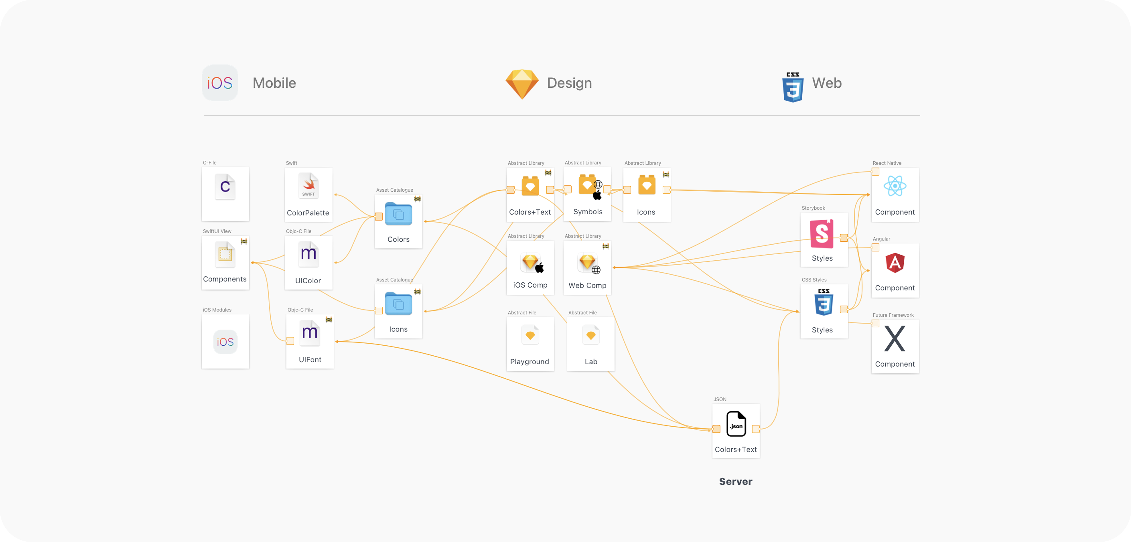
To illustrate the interconnected nature of a design system and set a vision for the team, I crafted a visual map using my Sketch prototyping tools. This map aimed to demonstrate the holistic view of all components for an MVP design system.
This strategic visual representation served as a means to bridge the gap and establish a clearer understanding of the design system's comprehensive and interconnected nature.
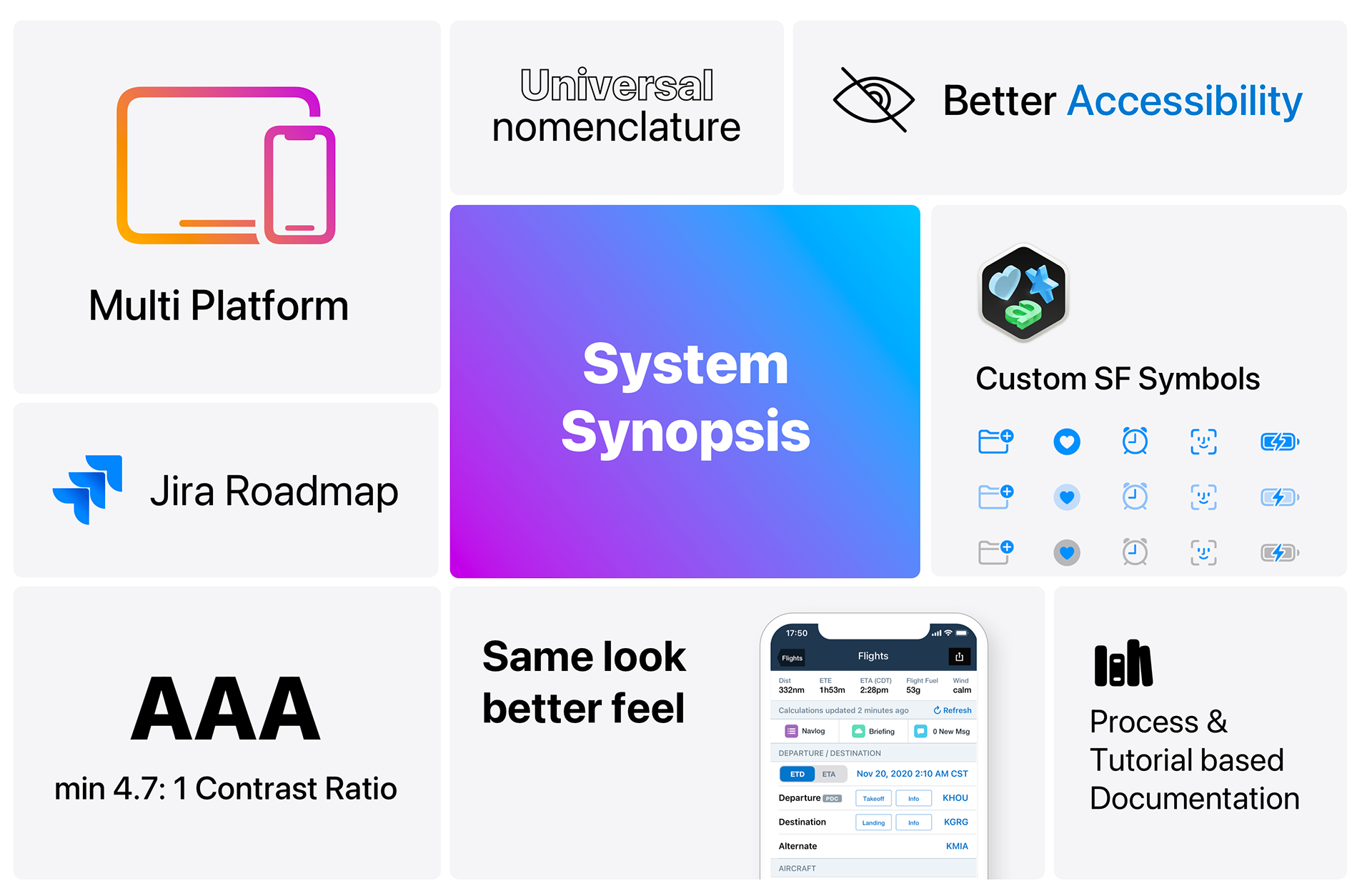
Simplifying current UI patterns
The ForeFlight UI is constructed with stock iOS components, resulting in a dense and busy interface. Therefore, simplification was crucial, emphasizing surfacing the essentials on top and placing everything else in the background to create color harmony.
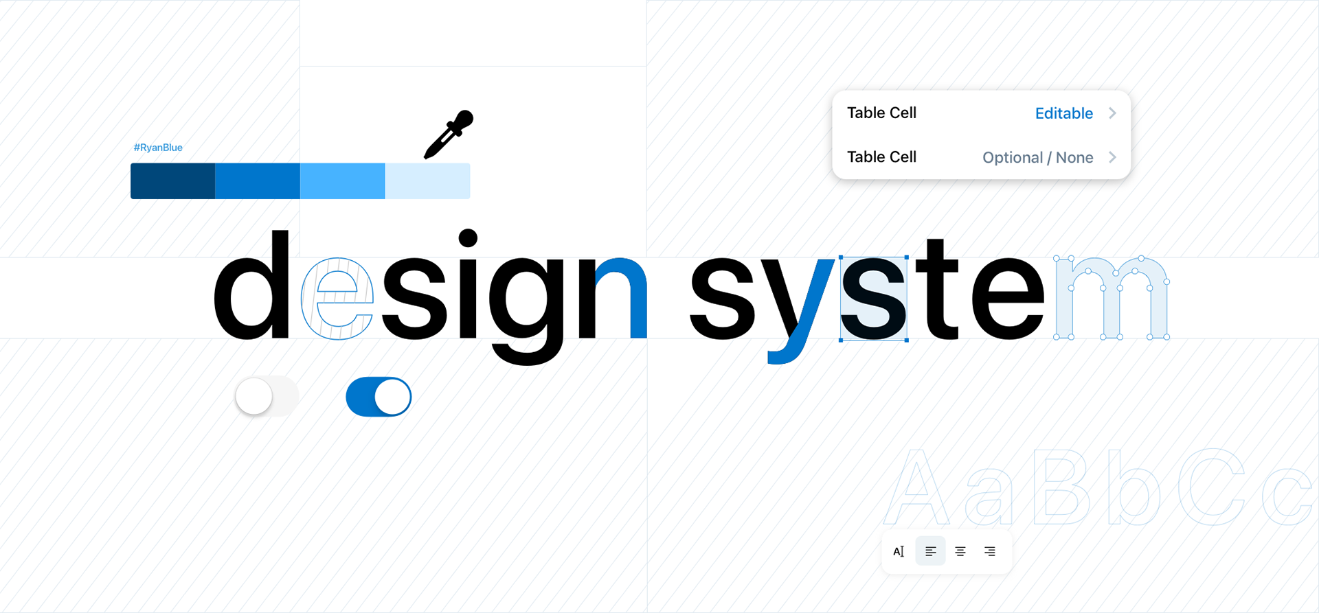
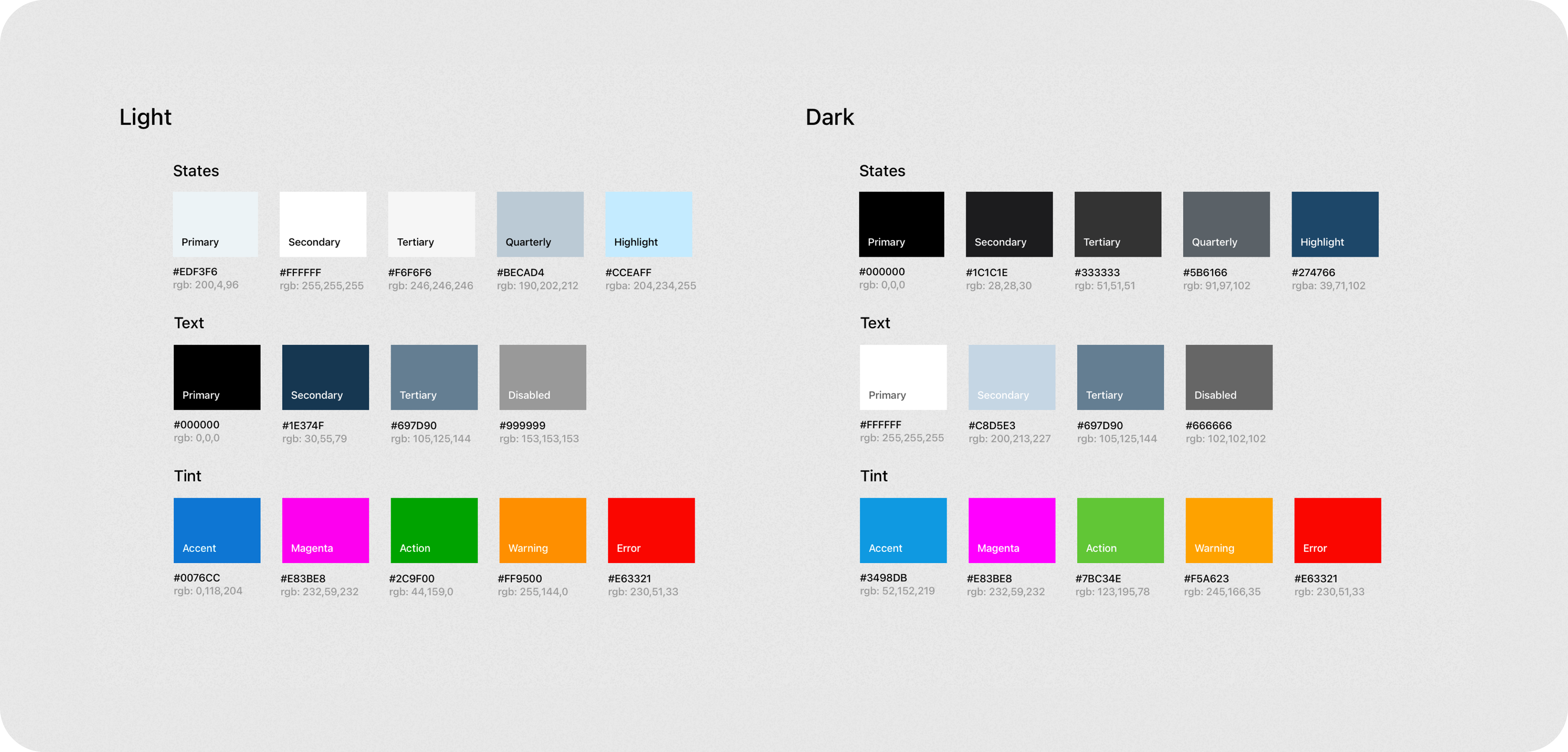
Color Palette Optimization
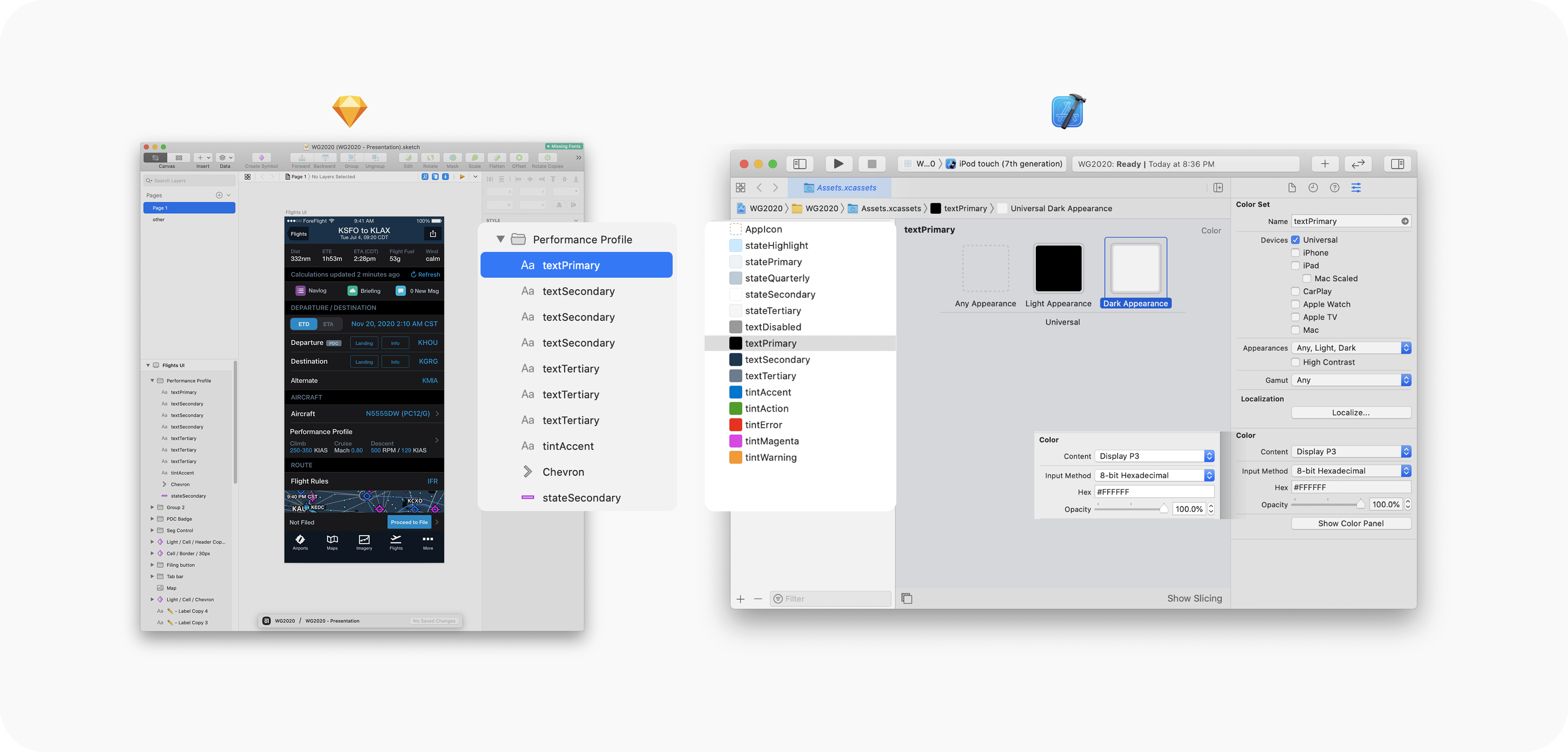
During the audit of the current styles in code and design, I identified more than 120 colors and transitioned them to a more robust and reduced palette of 28 colors. This palette defines all interaction states, including those for text, icons, and different accent tints. This simplification led to the natural unification of nomenclature with specific scales for each group.
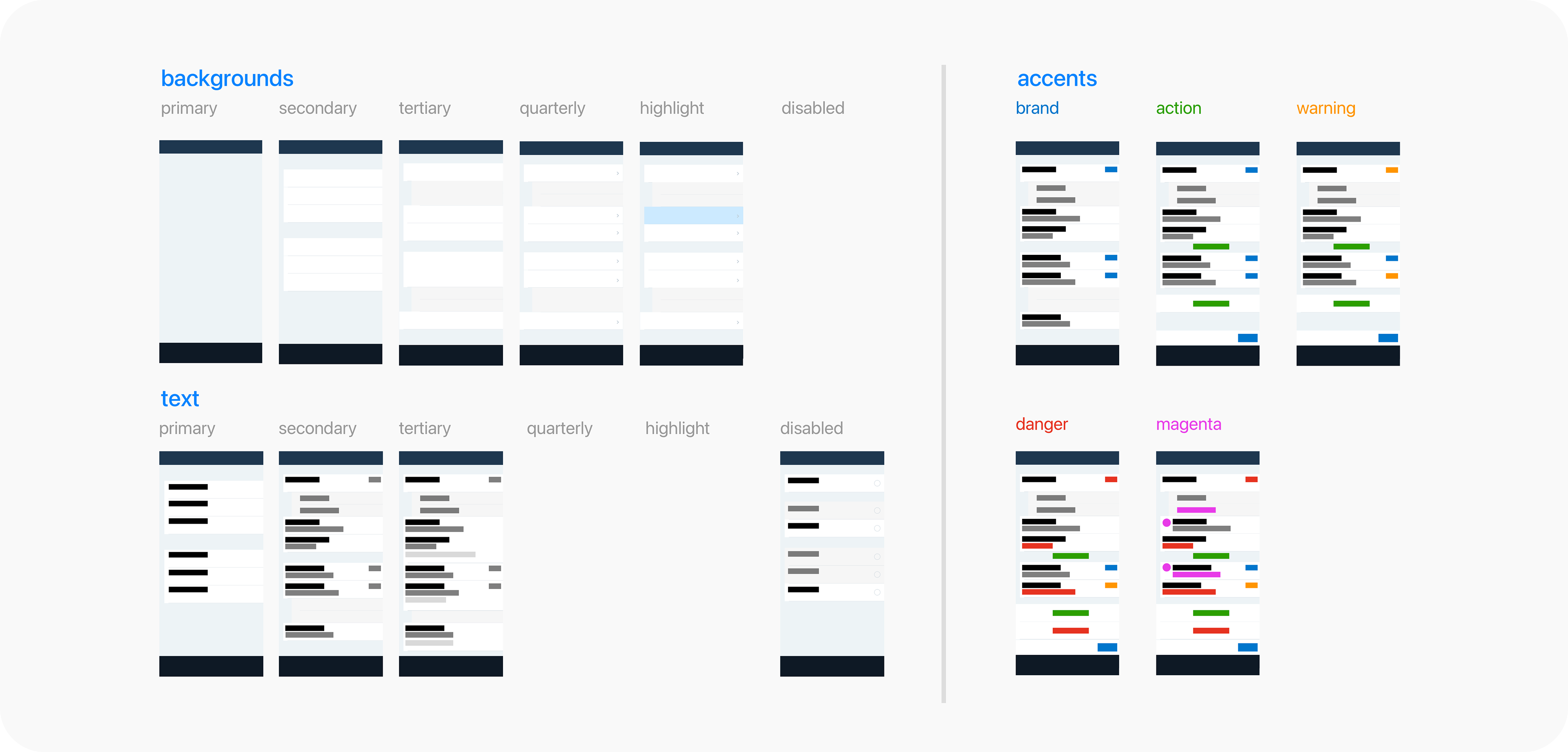
Information Architecture
Subsequently, I divided the UI into its individual groups, ensuring clear and simple information architecture for both designers and developers. Finally, I translated the design styles into developer-ready styles and imported them into the Swift style dictionary.
Organizing design assets
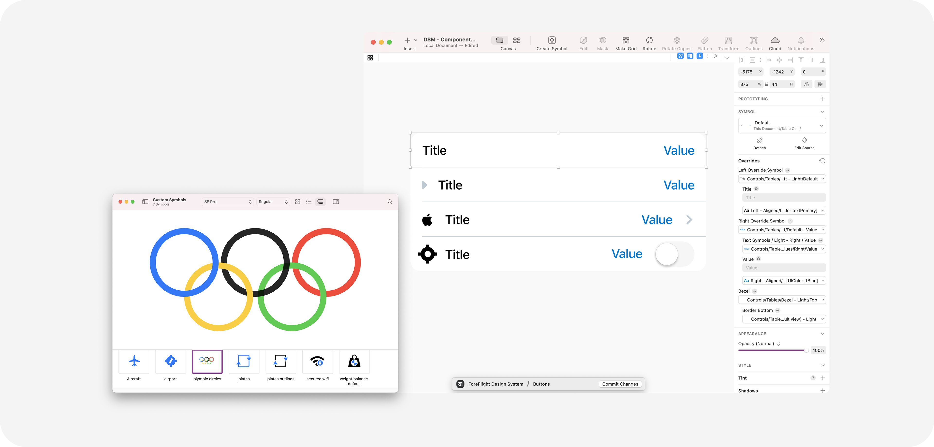
I have organized the styles and components into respective libraries to enable manipulation in isolation without affecting production designs. The entire design component work was conducted using Sketch as a design tool and Abstract as a version control tool.
Prioritizing High Traffic Components
I prioritized high-traffic components for the designers, starting with table cells, which compose more than 90% of the iOS UI. Redundant asset creation was eliminated by adopting SF Symbols, which are developer-ready and much smaller in size for implementation. The web design team translated all SF Symbols to static SVGs to unify our UI.
Multi-Design Library Architecture
The architecture of multiple design libraries, coupled with a developers-first mindset, allowed the team to leverage pre-built technologies and expedite their work. The adoption felt seamless, as none of the teams had to change their workflows to adapt to the changes.
Accessibility Built in
The iOS platform is widely used on the go, and this holds especially true for ForeFlight. Pilots rely on the UI's readability and quick identification of important functionality while executing complex aircraft maneuvers, whether in bright sunlight or very dark environments.
Higher contrast ratio
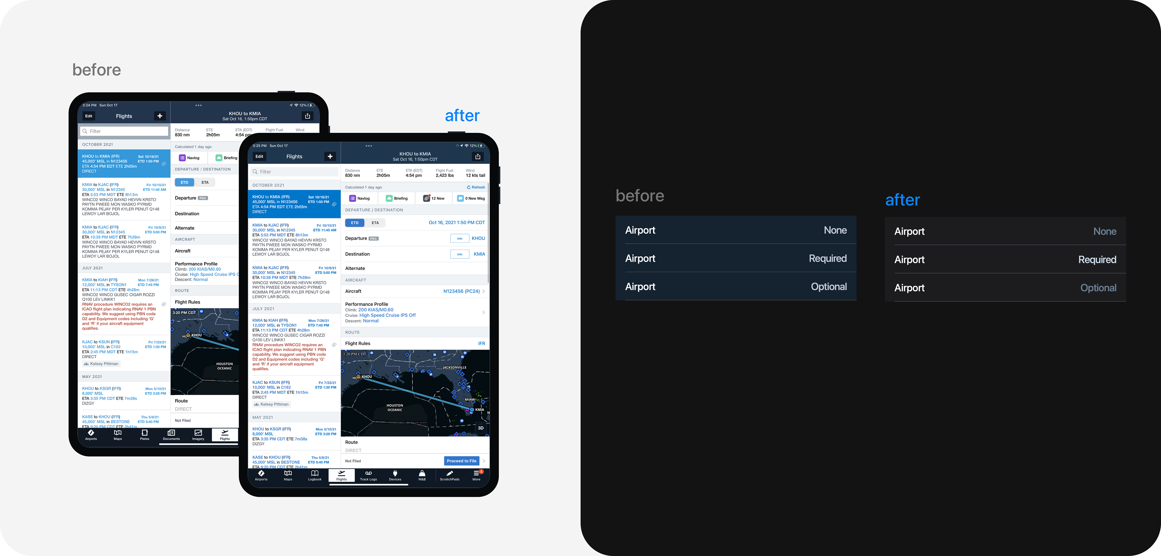
One of the initial outcomes of the color refactoring was the removal of all low-contrast 2.5x or 3.6x colors, enhancing all colors to be at least 4.51x. This simple change boosted the vibrancy and readability of numerous blocks of text, even with sun glare on the iPad display.
Better dark mode color prioritization
The entire ForeFlight UI is data-heavy, involving numerous forms and input fields. One challenge was to create a color palette that distinguishes optional from required fields, reducing the time to fill out forms and enabling pilots to quickly get back to flying or landing at night.
Better typography
Since 2007, ForeFlight has used Helvetica Neue as its primary font system. In 2020, we took the opportunity to transition the entire UI to San Francisco. Although updating text styles in a dense UI posed challenges, the final results provided clear character separation balanced in size and spacing, improving overall legibility by 2x.

Additional work and final words
By deploying the design system into production, the team completed the first of many cycles for the design system. As a product manager and design system designer, I initiated the process by creating the initial roadmap and defining delivery items for the design system, while also forming the design systems teams.
The creation of libraries and the establishment of initial styles marked the starting point for the ForeFlight design system. Although developing processes and libraries proved to be challenging and took nearly a year to establish, it was only the initial phase. The most difficult aspects of the system, such as maintenance and contribution models, were yet to be proven.
Since then, the team transitioned from Sketch to Figma, utilizing the design system as a migration tool without compromising design nimbleness and speed.
I personally gained valuable insights through this process, as I collaborated with various teams and groups at different stages of the work. This experience enriched my understanding of iOS and React Native Web development tools and frameworks, allowing me to learn a substantial amount.