Essentia Advisors is a financial company that manages oil and gas wealth assets for corporations
Assembling the north star
Essentia Advisory specializes in providing management and technology implementation services to clients in North American Energy and other commodities markets. The company enlisted my expertise to revamp their outdated identity, which no longer aligned with the young and technology-oriented culture they were cultivating.
To achieve this in 2018, I conducted persona interviews with key stakeholders to understand the company's ethos and aspirations. The goal was to create a corporate creative direction that would address the company's dual objective of positioning itself as a mature and experienced firm among competitors while projecting an image of innovation and startup vitality.
The primary guideline for the new identity was to be explicitly bold, conveying a clear and dynamic direction in line with Essentia Advisory's vision.
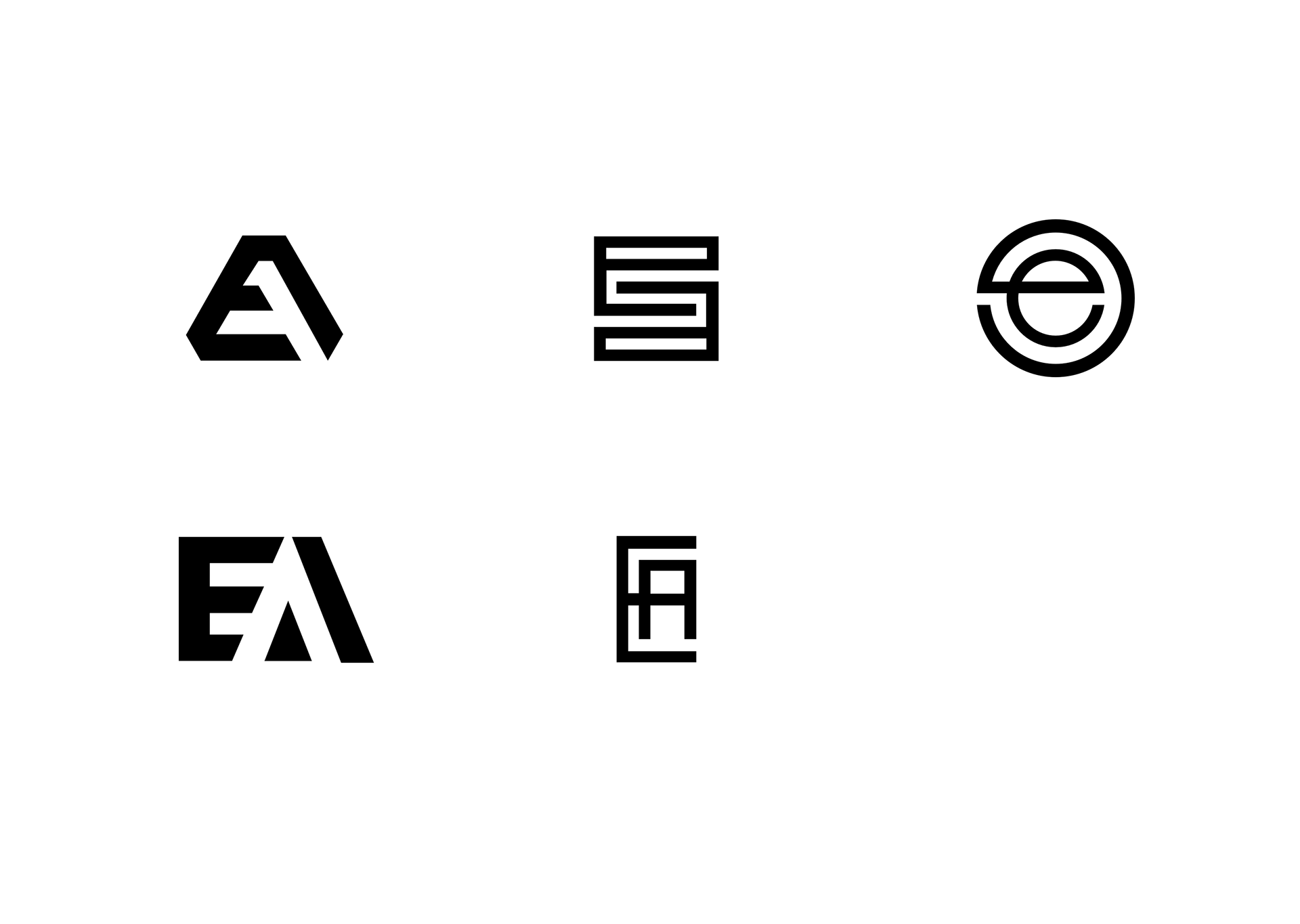
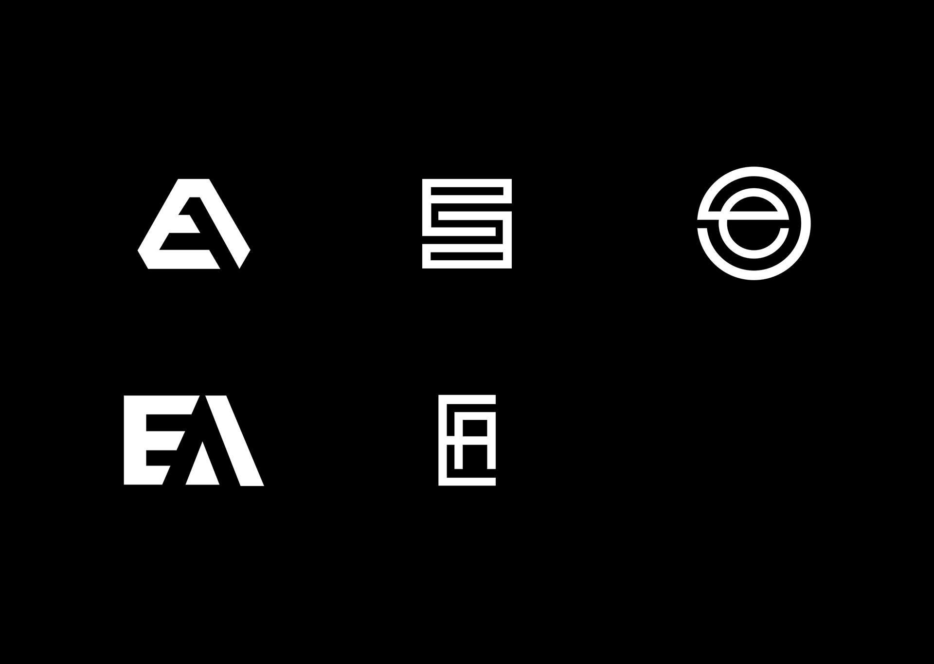
A strong visual brand seal
After collecting insights through interviews and secondary research on the company's tone and voice, I delved into exploring various directions for their logo. The key themes of contemporary, bold, and trustworthy were paramount in my mind during the design process. It was crucial for the logo to stand alone and possess distinct elements that could effectively represent the company across diverse printed and digital assets.
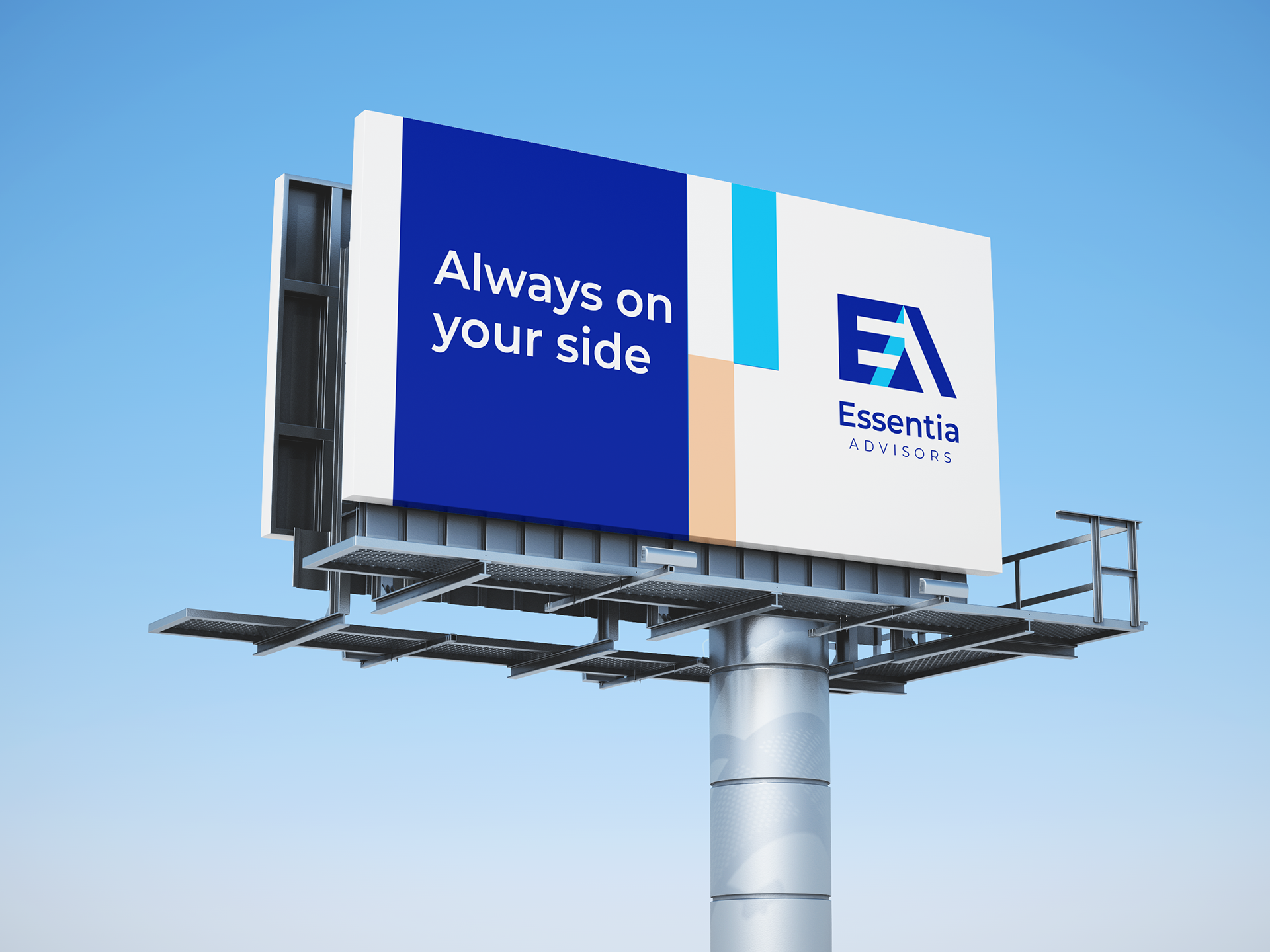
For the color palette, a vibrant and deep blue was selected to establish a sense of an established brand, even though it was a startup. A single hue, slightly different from the main palette, was strategically incorporated as an accent to infuse a youthful and playful spirit into the brand.


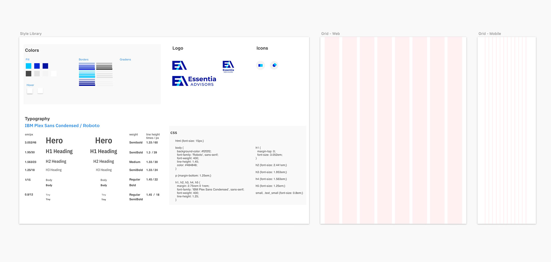
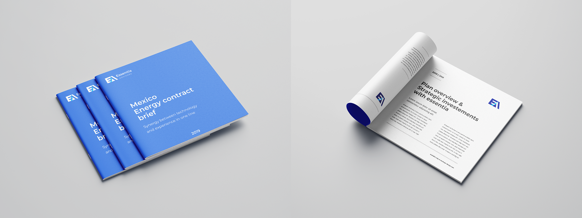
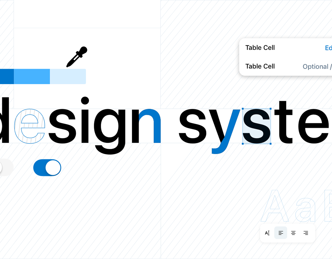
Creating a visual brand guidelines and final deliverables
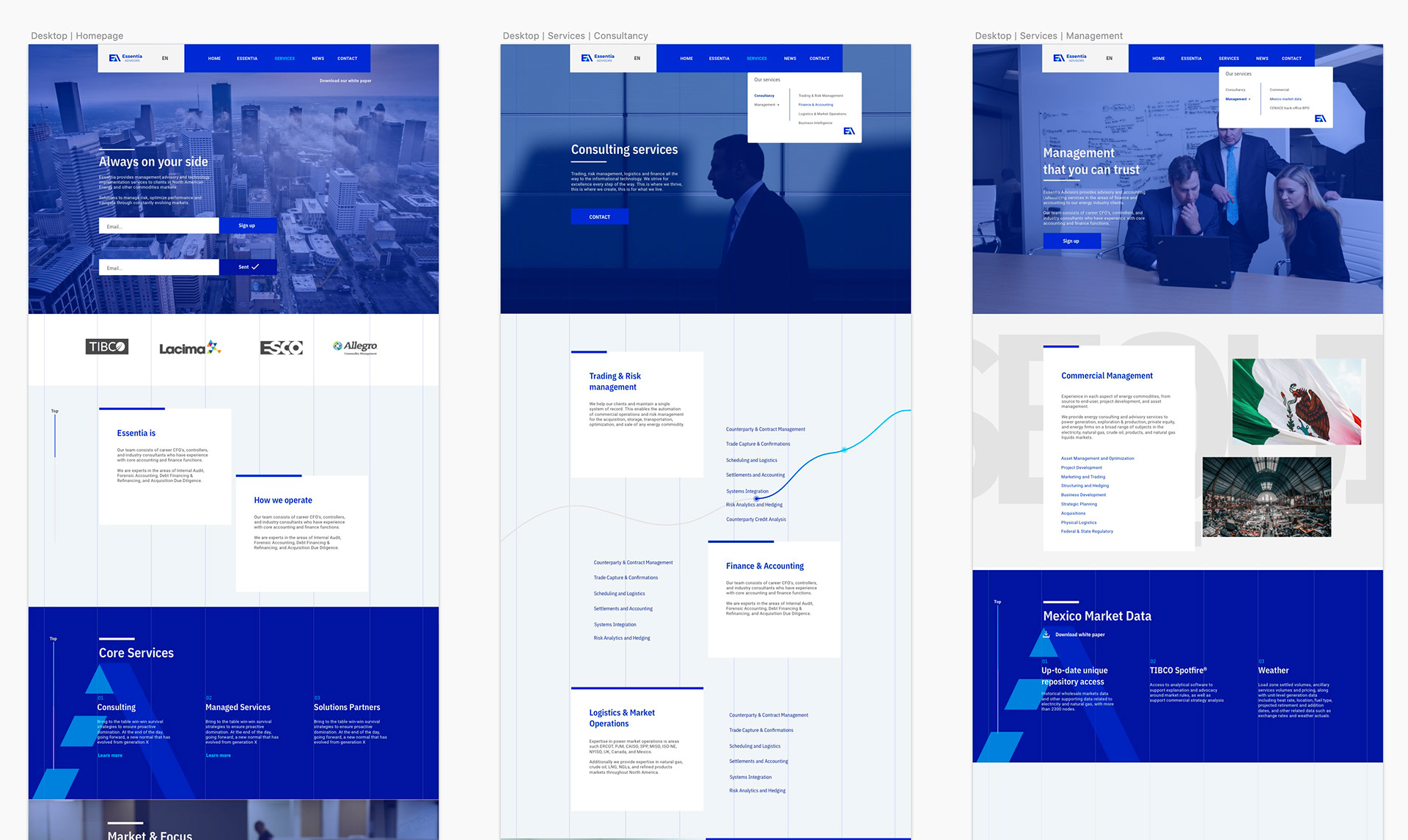
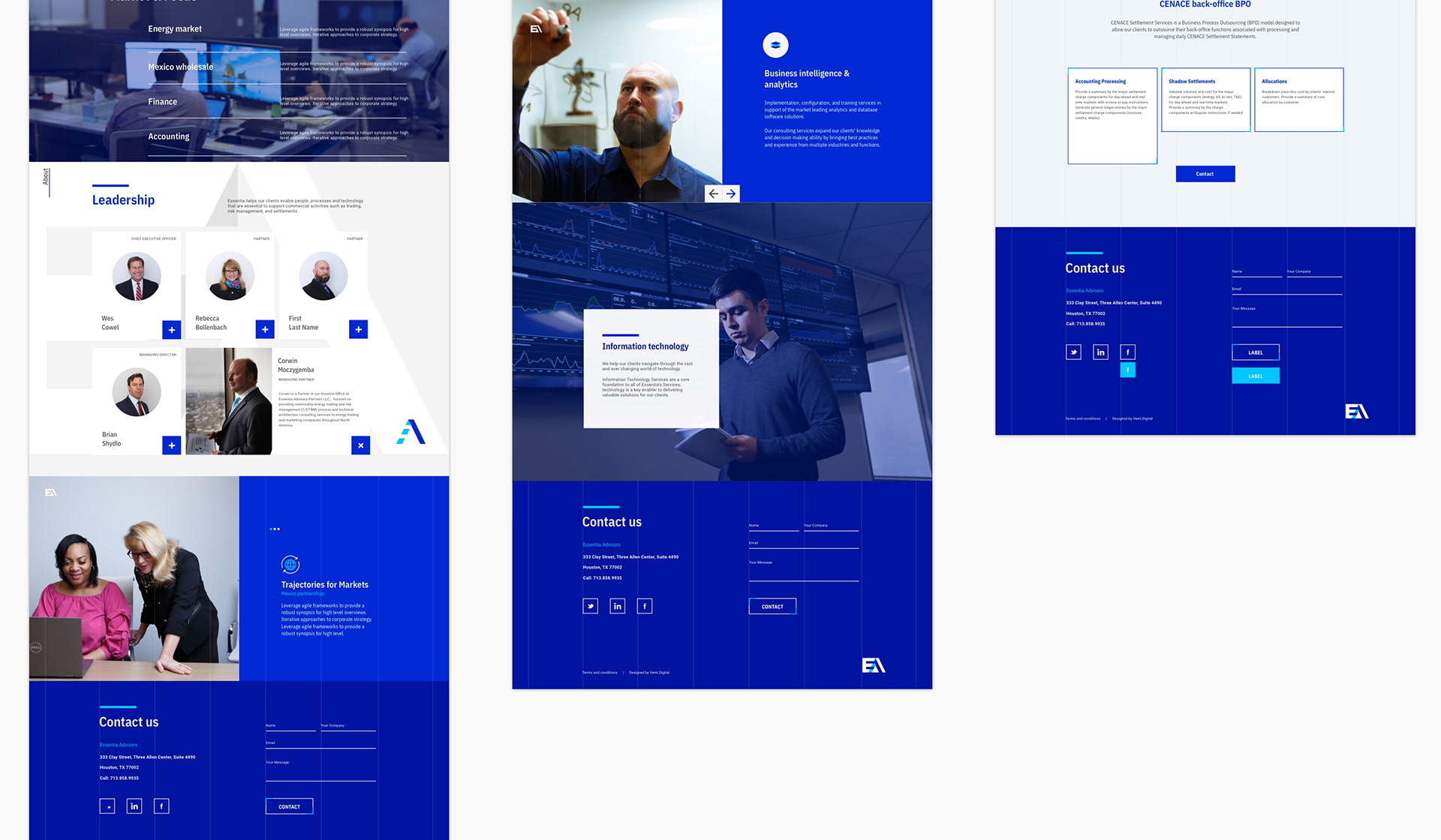
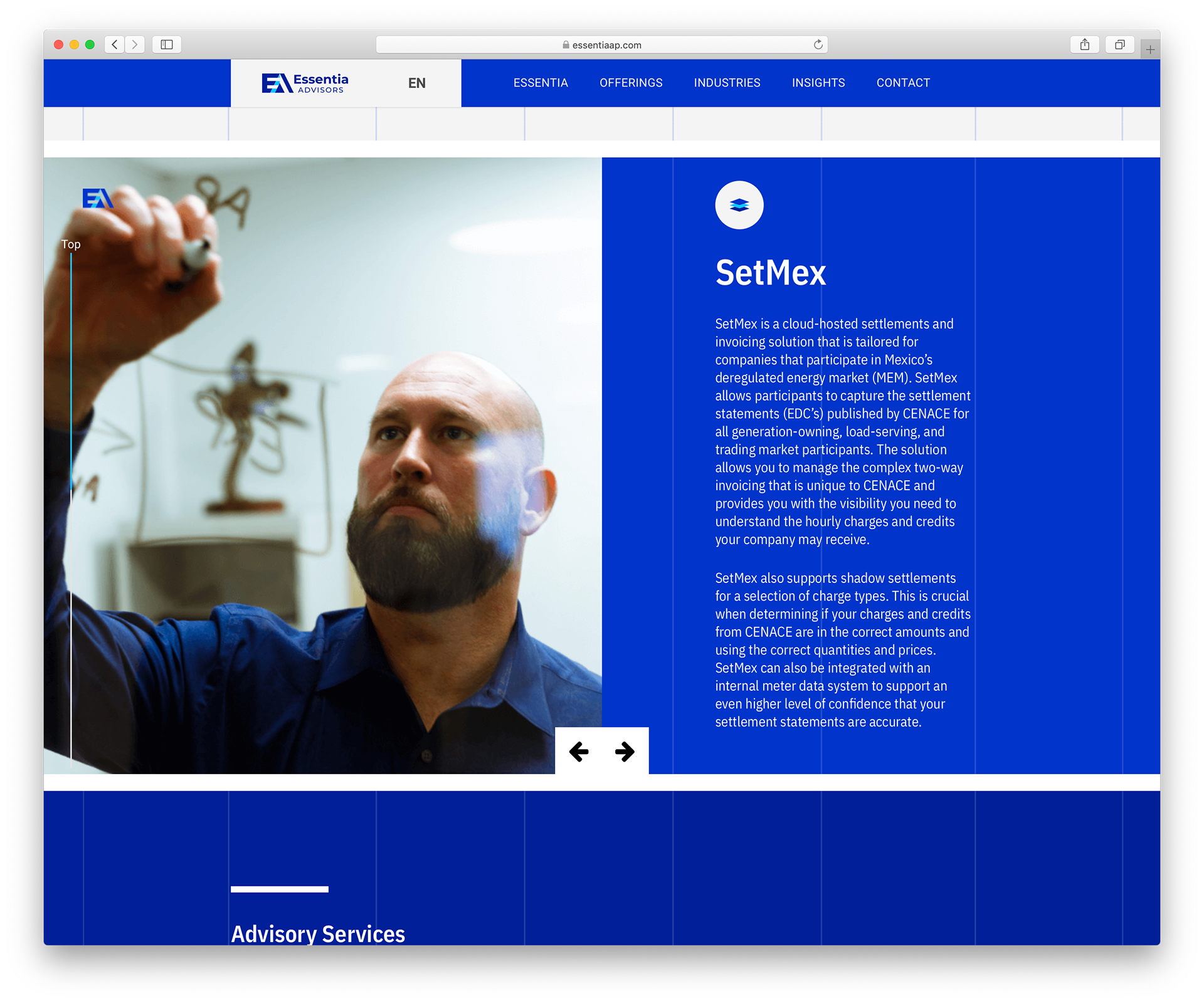
By defining the color palette and various logo variations, I laid the foundation for the visual identity. Expanding on this, I utilized the logo's diagonal directions to accentuate different sections. Leveraging the IBM Plex typography offered a range of contrasts and a complementary feel. The font's legibility was crucial, especially for lengthy paragraph sections where the company aimed to educate its audience about offerings and services.
The culmination of these elements came together in the final website design, showcasing the brand's adaptability in a digital format without compromising its essence. The design not only functioned effectively but also demonstrated how the brand could be dynamically represented in the digital realm.