BrightWay is the new credit card service provided by the lending leader in the USA OneMain Financial
BrightWay Credit Card for the people looking to build their financial future
BrightWay Cards, operating under OneMain Financial and going beyond traditional financial services to support individuals in their credit journeys, closely collaborates with OneMain Financial, known for its lending services. Together, they offer a diverse range of credit cards. Ending 2021 with approximately 60,000 customers, BrightWay aims to exceed a million by 2023, anticipating significant growth in 2022.
Facing a surge in customer calls at the end of 2021, particularly related to login issues, payments, and locked cards, which resulted in monthly operational costs of ~$250000, our design team was tasked with developing digital journeys. The objective was to reduce call volumes by creating universal help flows, ultimately enhancing overall customer interactions.
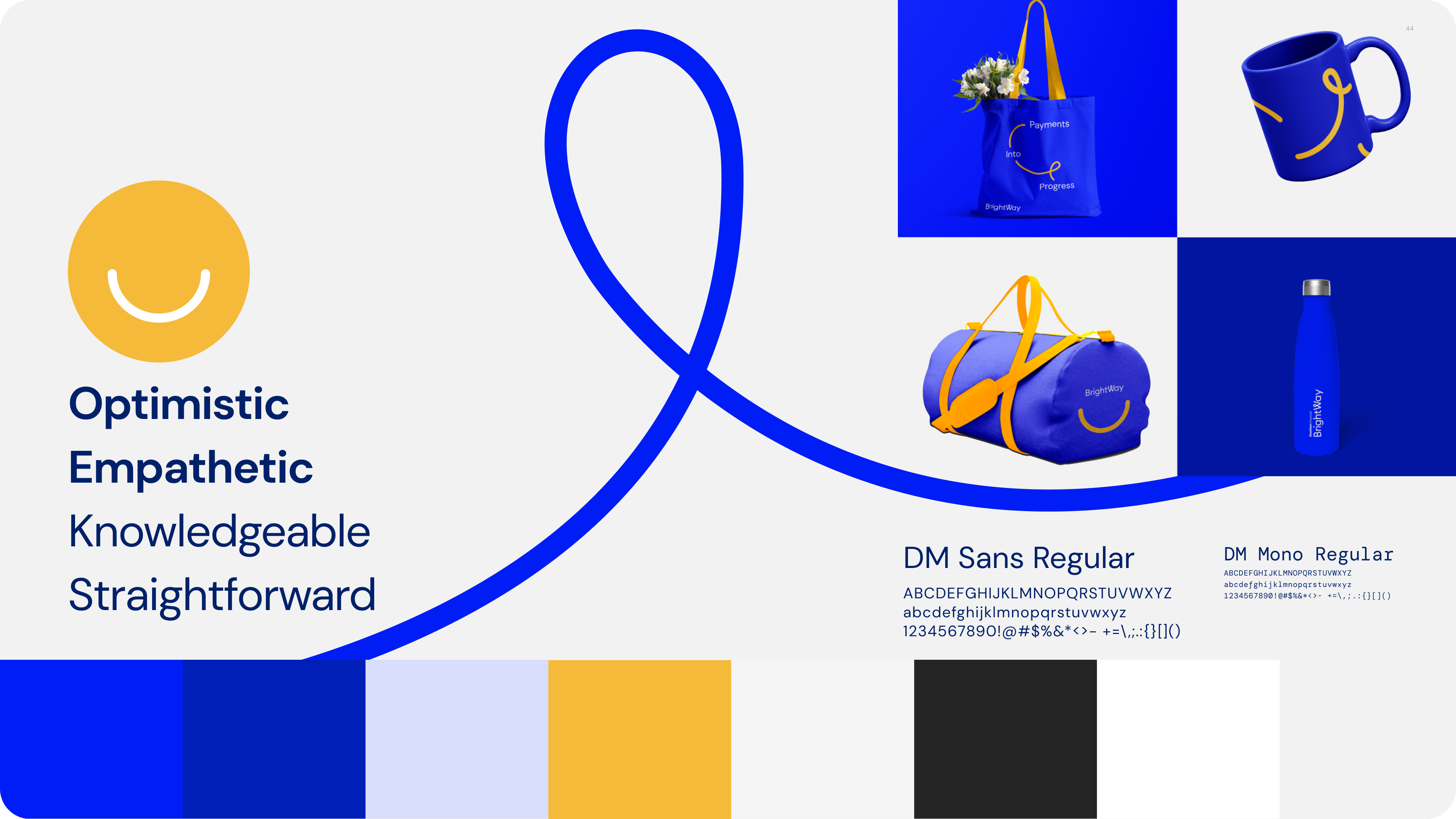
Expanding BrightWay branding language:
Develop universal help writing and flows by adapting the user interface and visual design of BrightWay brand of friendly and knowledgeable.
Create self service framework
Identify and rectify dead ends and pain points in customer journeys for a diverse audience. Develop and impart robust mental models for addressing common issues. Create familiarity with problem resolution by crafting repeatable UX patterns.
Embarking on the Journey: Unveiling Insights
I kicked off with a detailed UX audit, secondary research, and categorization of user feedback from app store reviews and social media complaints. Data analysis, in collaboration with our engineering team, identified login issues as the primary call driver.
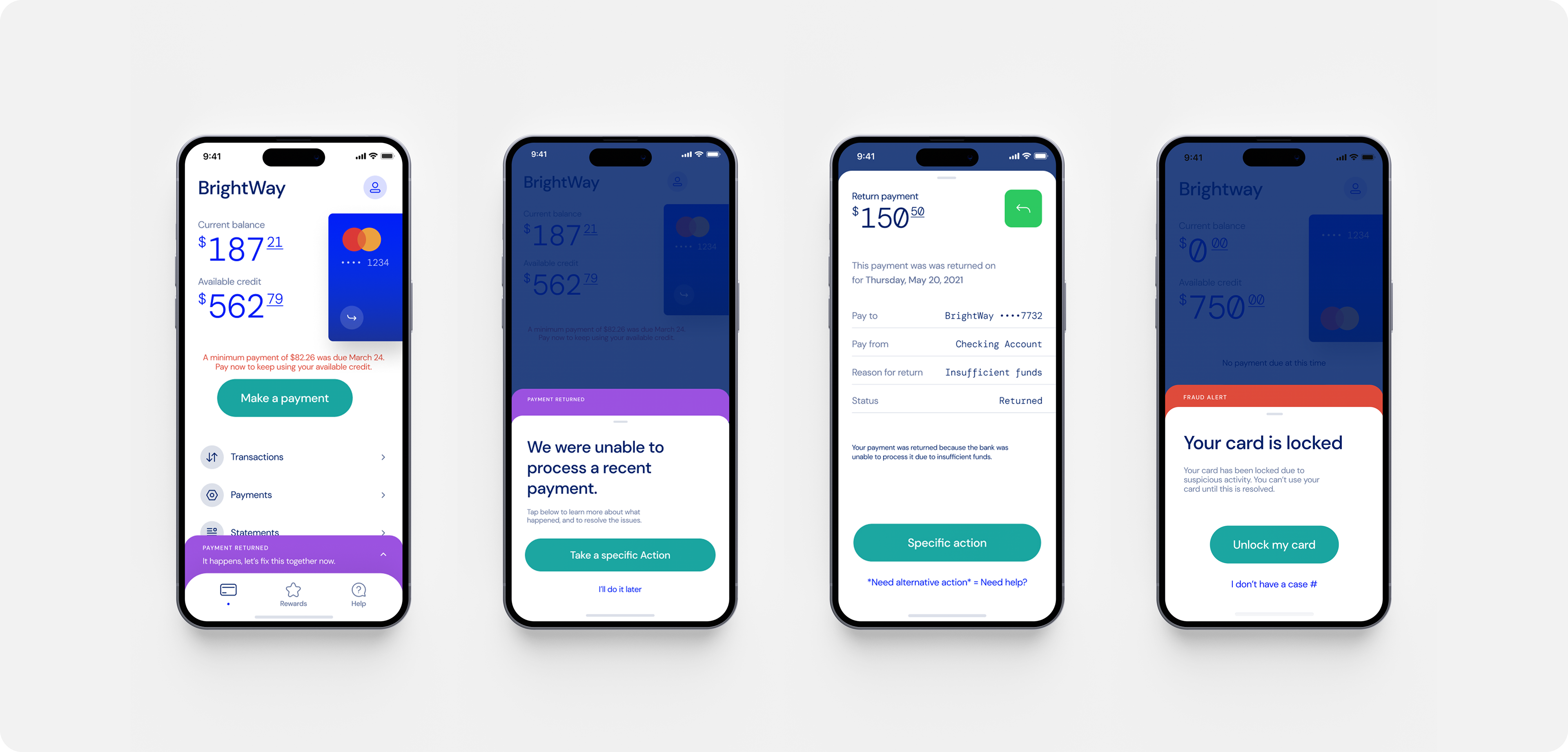
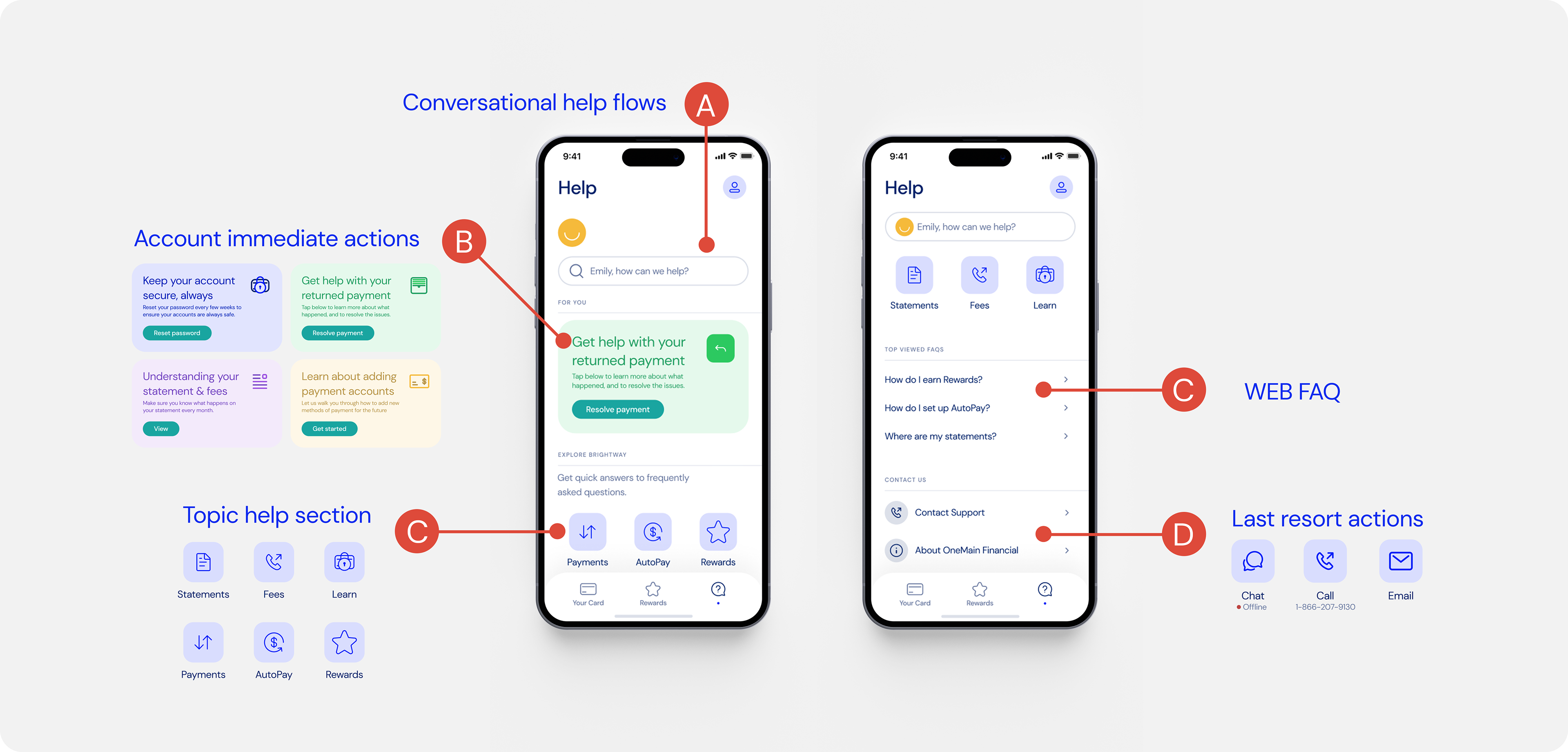
The current approach of having generic "Want help" buttons in the UI was definitely not effective and needed to be addressed first. The initial intent to get help by being directed immediately to call without trying any solution first was what was hurting the bottom line of the business. With this realization, I need to craft a comprehensive help flows for each error scenario that might arise in the application.
Choosing a path forward
To overcome the current design shortcomings, my design process was structured around a two-fold strategy: Reactive and Proactive help.
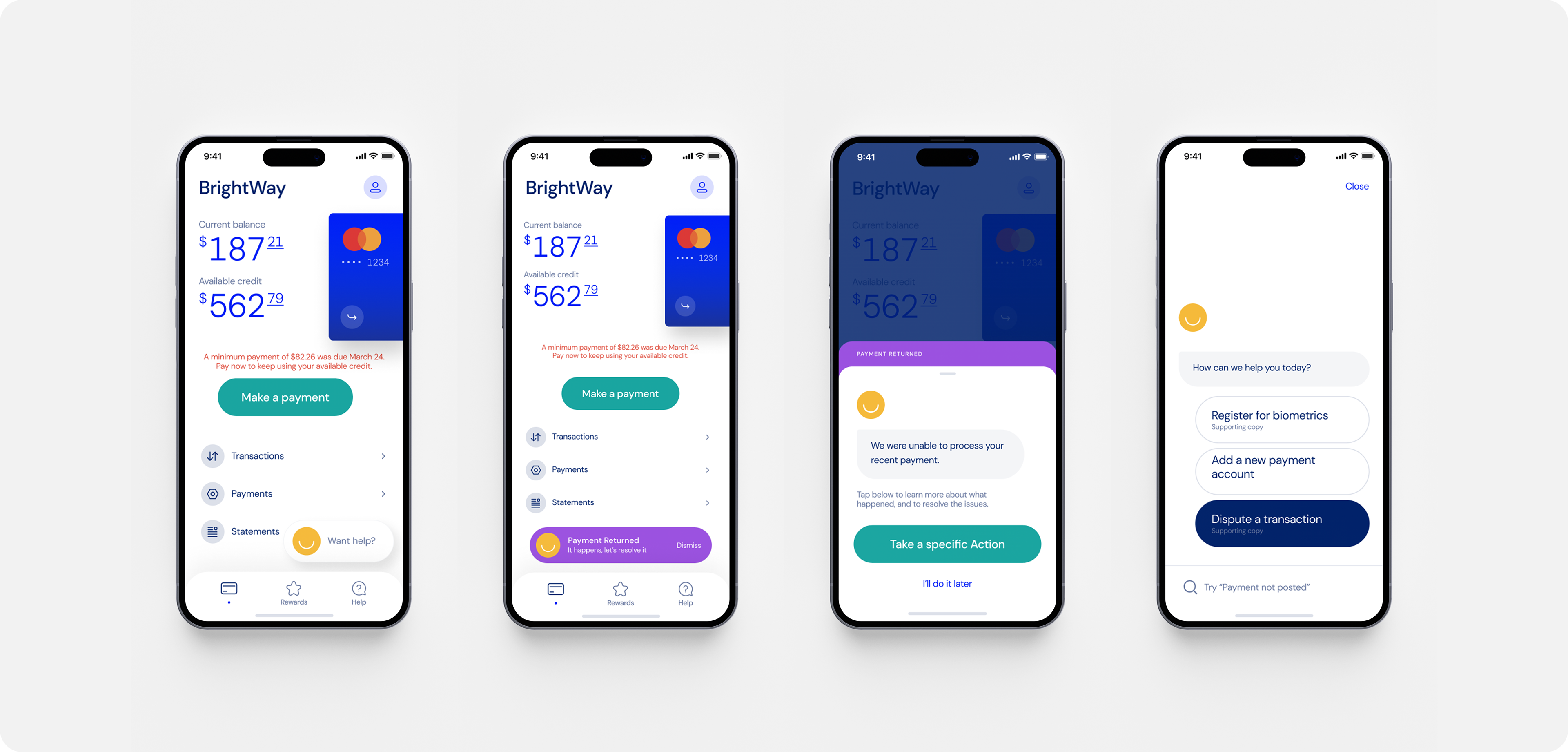
For the reactive approach, I replaced generic buttons with specific actions and introduced self-guided chat flows. The proactive approach aimed to anticipate user needs, directing them to chat self-service flows before resorting to the call center.
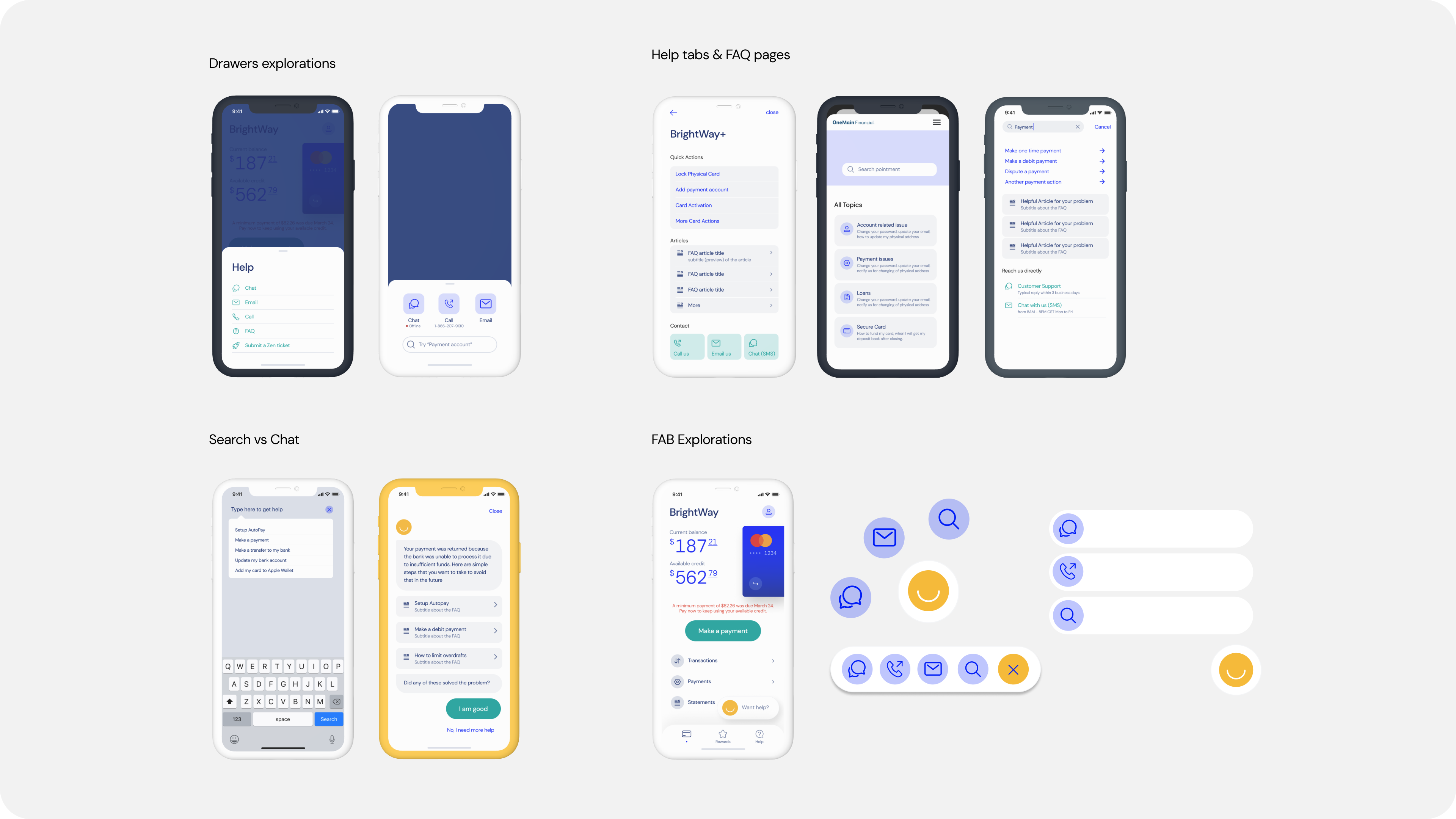
Ideating on the visual language and flow
There are many visual elements that can be used to guide users to complete an action. By taking the BrightWay straightforward design principle as my guideline, I have eliminated the concepts that need extra seconds for interpretation or necessitate too many taps to complete an action, such as floating action buttons (FABs).
Shaping the Narrative
I applied the design guidelines of the BrightWay brand to pinpoint moments where customers anticipated specific actions. Instead of using generic statements, I rebranded them with corresponding actions. This straightforward approach not only ensured users understood the intended actions but also established a consistent UX pattern, setting clear expectations.
Through design I have elevated the brand emoticon of BrightWay making it an integral part of the resolution process. The emotional aspect of the yellow happy emoji makes the whole process a tiny bit better than a generic help icon personalizing the brand and creating a positive emotional connection.
Finally, I developed self-service flows for each action, guiding users seamlessly towards the solution.
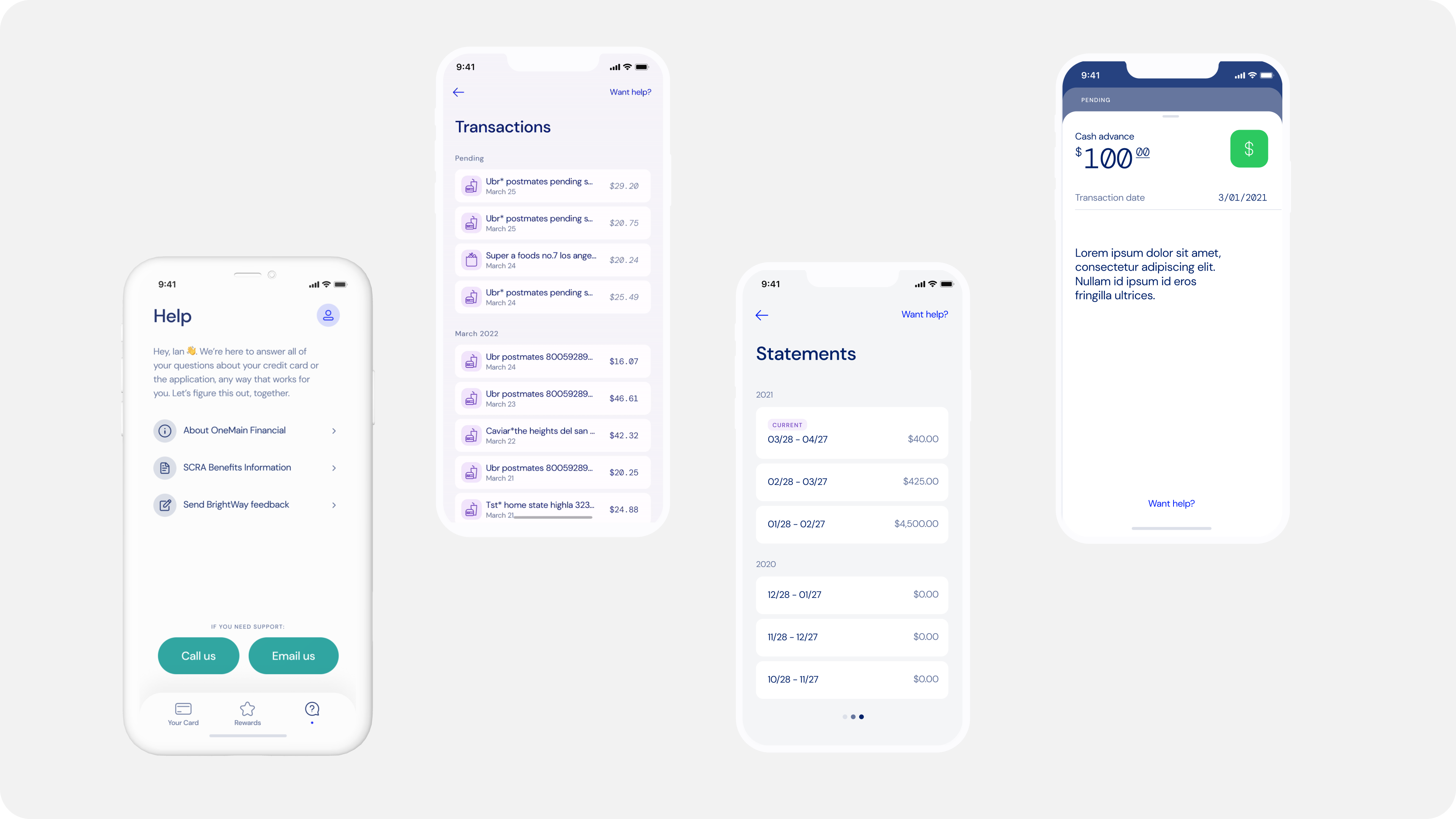
The place to find all the answers
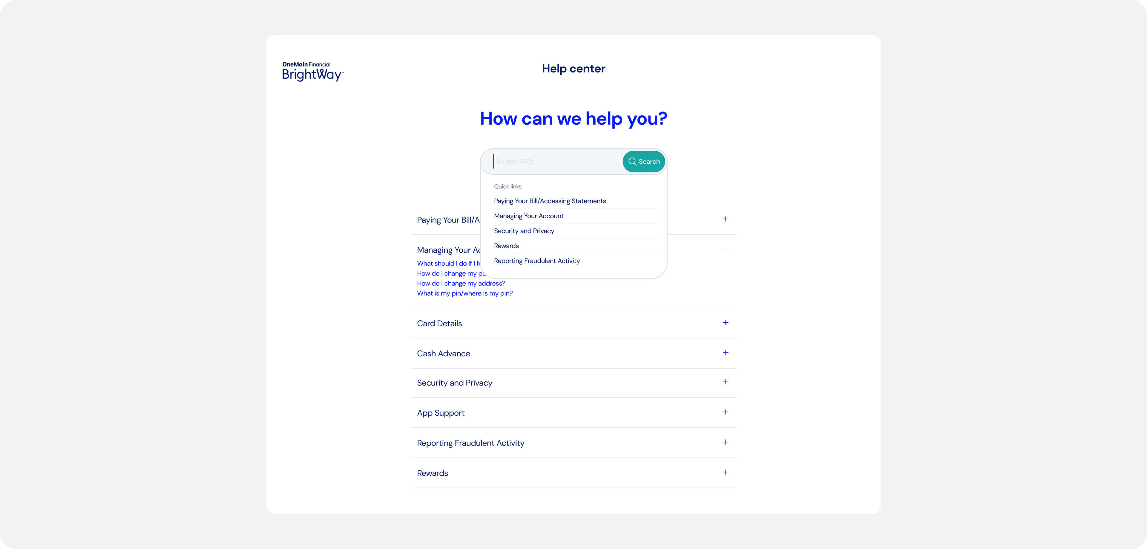
I simplified the search for answers by introducing a self-service help hub in a dedicated section. This hub serves as a central spot for users to perform actions like changing their address. It also provides access to informative articles, customer support contact, and an interactive chat agent tailored for self-service flows related to payments, account locks, and disputes.
I have added final touches to the hub by making it accessible without the need for login. My team and I worked on a FAQ webpage that could be accessed from anywhere. With these details in place the design provided clarity and empowerment to BrightWay customers that they are in control at all times.
Reflection and key results
The success of our project lay in the universal help feature, there when needed and working behind the scenes when not. Calls related to logins saw a significant decrease, validating the efficacy of our design decisions. The MIRO board played a pivotal role in communicating the intricacies of our flows to the development teams, emphasizing the importance of visual clarity in project communication.
Universal Help Feature
Quantifiable metrics showcased a 67% reduction in call volume, demonstrating the tangible impact of our design enhancements. The balance between technical feasibility and pushing the boundaries of our team's capabilities defined the success of the end solution.